What is Responsive Design?
Over the next number of weeks we are going to help you in understanding what Responsive Design is and how will it impact my business/website?
In our 1st blog of 3 we are going to talk about what exactly is Responsive Design. Simply your website has been designed in such a way that it’s automatically fits the screen of any device. This is not to be confused with Mobile Friendly Designs or Mobile Sites (we’ll get to those in the next blog). In some cases they are built to automatically detect the device that you are viewing them on and will resize the screen automatically.
Simple? 
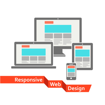
Mashable gave a great description of how it works “a responsive web design uses "media queries" to figure out what resolution of device it's being served on. Flexible images and fluid grids then size correctly to fit the screen.” Our image really sums up what responsive design is all about! Mobile, Tablet, Laptop and PC – You’re site will work on each of them all, but will look a little different!
A great way of testing if a website is responsive is to view it on a desktop browser and try making the browser window smaller, the images and content should reduce in size and fit the screen. The menu button usually disappears and becomes a touchable or clickable box and the content will still be the same throughout.
The Benefit
With a Responsively Designed Website you don’t lose any content, it is just shown a different way. This is super news when it comes to your SEO and Google! Google gives “bonus marks” for sites that have a mobile site and see responsive design the crème de la crème.
In real terms Responsive Design is the future of web design.
If you’d like to talk to us about getting a responsive design to your website please just give us a call on 01-2990655 or email us at sales@webtrade.ie We’re here for all your Web Design needs.